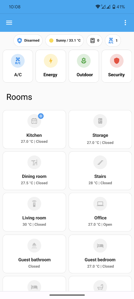
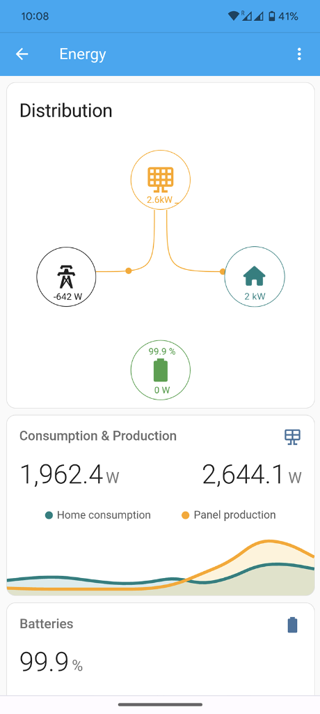
Default Home Assistant
Basic UI, lack of flexibility, unintuitive and confusing to use
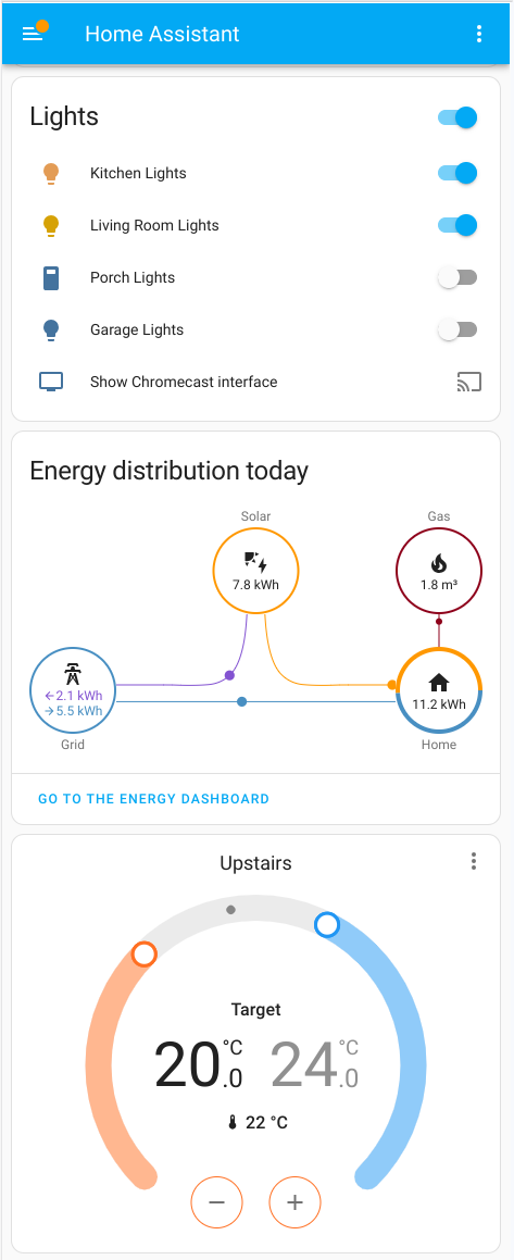
Improved Version
Intuitive interface with clear UI, simple to use and easy to navigate
My Role & Value
The Impact
The Context
A family (ranging from their 30s to 60s) needed a dashboard to manage their solar panels, heat pump, smart lights, and sensors from their mobile phones. While tech-savvy, they weren't used to home automation but were highly focused on optimising energy efficiency.
The Challenge
Transform a basic, inflexible default interface into an intuitive, centralised dashboard. The challenge was to balance a personalised UX with the strict reuse of out-of-the-box components to guarantee long-term stability without requiring technical support.
"What if only the most useful information and features were displayed in one single place for quick decision-making on monitoring, controlling, and optimising the house?"
The Process
Direct experimentation with Home Assistant features proved crucial to strike an optimal balance between user experience, technical feasibility, and long-term maintainability. Guided by continuous usability testing, I rapidly refined the UX to focus on immediate house overviews and instant feedback.
Key Features
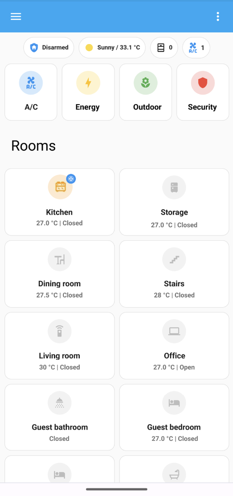
Removed Welcoming Message
The 'Hi, [name]' greeting drew attention away from crucial status chips, leading to their consistent neglect.
Chips for Overall Insights
Top-level chips proved highly valuable for immediate status checks (e.g., alarm status, open windows).
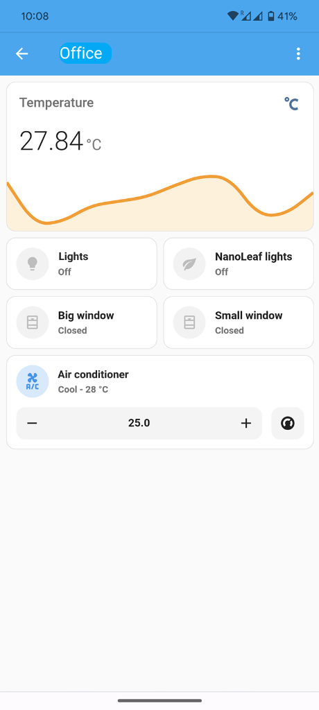
Optimised Room Buttons
Fixed conflicting functions and added critical window and A/C status to aid energy optimisation.
Added A/C Navigation
A dedicated 'Conditioning' button centralised control for all home conditioning appliances year-round.
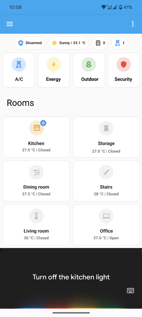
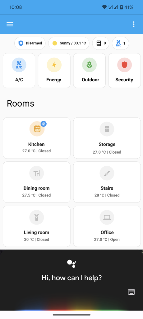
Automation First
Emphasized automation and voice control via Google Assistant for enhanced UX, while keeping manual actions accessible.
Final Output